Apollo: One token system across 4 products
Apollo is a token-based design system: colour, spacing, and theme values are defined once and consumed everywhere across Figma, Storybook and every product.
Year
2024
Type of Project
Company Project
My Role
UI Designer & Project Lead
Stack
Figma, Zeroheight, Storybook

Case Study
The Goal
Hydra X offers exchange infrastructure across 4 products that grew without a shared design system. With no shared tokens, every designer invented new tables, forms, and buttons from scratch, and every developer built them differently, so products looked nothing alike and engineering spent its time fixing visual discrepancies instead of shipping features that brought value to the business. Apollo, the tokenised design system Dedi built, had two jobs to do:
Make the product more competitive and polished
Sales needed a product that matched the price it was pitching. Instead, 4 years of accumulated design debt left it looking outdated and inconsistent.
Build a single system for a white-label product
The white-label product needed one system every client could reuse, not a rebuild each time. Without shared tokens, every designer invented components and every developer built them differently.
Chapter 1:
Picked a foundation, then extended it
Dedi evaluated a few component libraries and picked Ant Design as the base after aligning with tech and business on the most practical approach. Developers were already familiar with it, and it needed the least development time to modify for exchange-specific density such as real-time data, complex tables, and operator forms that the other libraries didn't fully support.

Chapter 2:
Built flexible token architecture for a white-label product
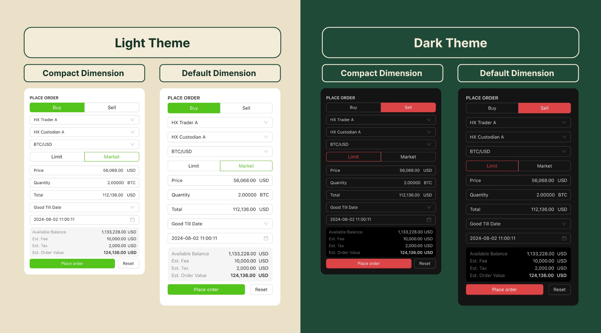
Each client needed their own look on top of the same underlying UI. Dedi defined modular tokens for spacing, typography, and colour that covered most client customisation requests, cutting the effort needed to theme each new client.
Chapter 3:
Built a clear pipeline to remove the single-person bottleneck
Components got tokenised in Figma, documented in Zeroheight, then tested in a Storybook playground before shipping into the product. Once that pipeline existed, designers and engineers built different features in parallel instead of funnelling every change through one person.

Chapter 4:
Governed consistency with patterns, not just components
Individual components alone weren't enough to keep four products coherent, teams could still assemble them differently. Dedi defined patterns, standard templates combining components in a fixed way, used at both the design and development stage, so whole sections of the UI stayed consistent, not just individual buttons and inputs.

Outcome
Sales reported smoother conversations with a more modern, trustworthy looking product. Engineers matched designs faster, and UI bugs dropped significantly to free up time for new features instead of fixes.
BEFORE
Several fragmented design systems
Deals lost from an unpolished product
Development time spent on bug fixes
AFTER
One shared design system
Higher conversion from a polished product
More features shipped instead of bug fixes
